


Making World Risk Poll data accessible to all with our new Data Explorer
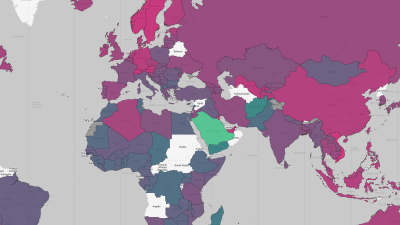
Aaron Gardner announces the release of our new World Risk Poll Data Explorer, an easy and intuitive tool for navigating data on people’s experiences and perceptions of risk featured in our four major 2021 Poll reports.

